Created on
Updated on
1898, Russia | World of Art
Artists always reject what came before, yet influenced by it at the same time
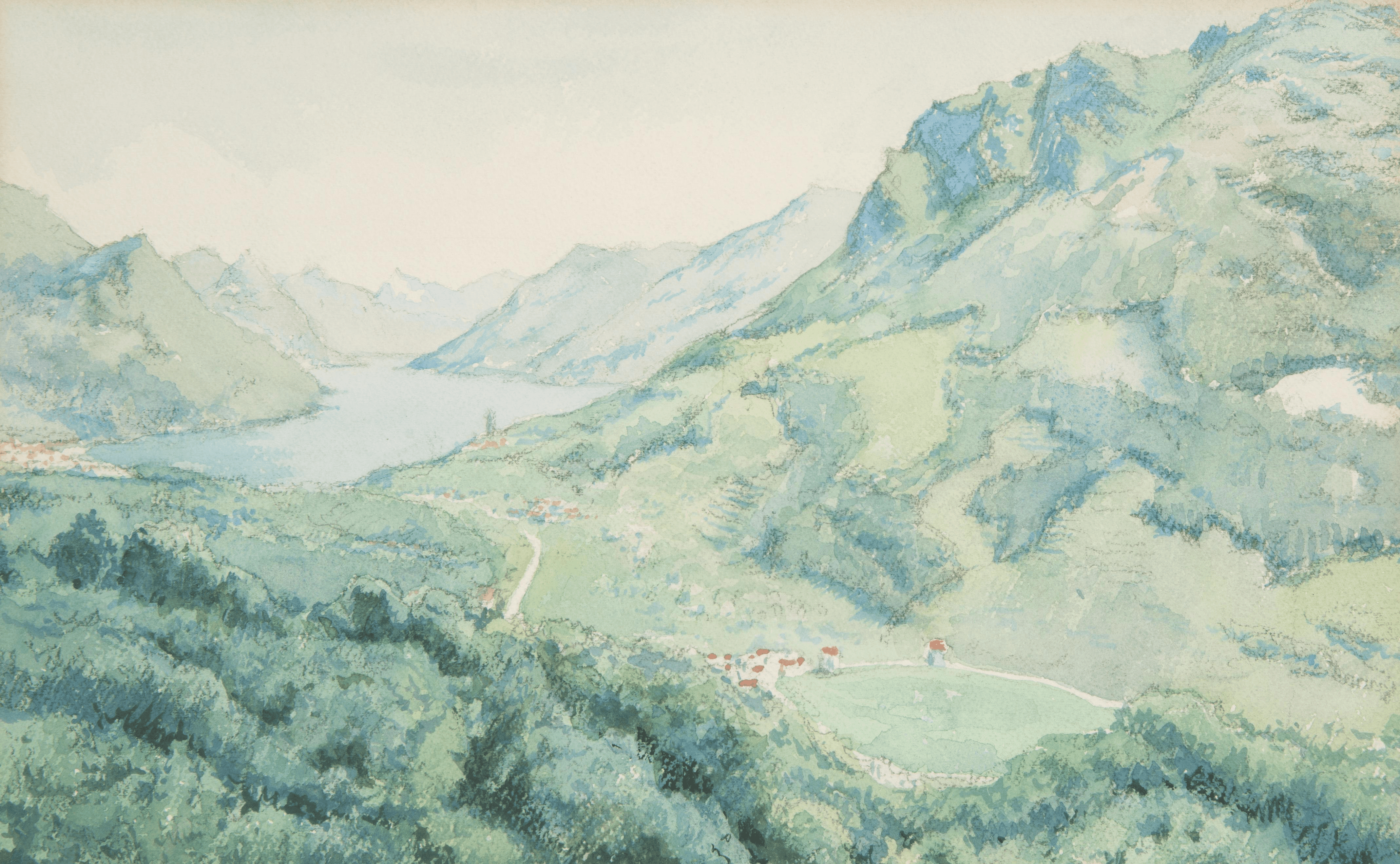
Preface: continued from the last post.
The Wanderers became the establishment
This is always what happens. The institution the Wanderers had rebelled against was the Academy. By the 1890s the Wanderers themselves had become an institution — with their own exhibition circuit, their own critical supporters, their own hierarchy of approved subjects and approaches. The radical gesture of 1863 had calcified into a tradition. The younger generation experienced the Wanderers the way the Wanderers had experienced the Academy: as a set of rules that told you what serious Russian art looked like, enforced by people who had stopped asking why. Social content, realist technique, Russian subjects — these had gone from being provocations against the establishment to being the establishment. The next generation had to define themselves against this, which meant defining themselves against social realism as such.
The first organized reaction came from Sergei Diaghilev and Alexandre Benois, who founded a magazine and an exhibition group called the World of Art in 1898. Their position was almost the exact inverse of the Wanderers: art had no social obligation whatsoever. The demand that painting serve political or moral purposes was philistinism — it judged art by criteria external to art. What mattered was aesthetic experience, formal beauty, the refinement of sensibility. They looked west — to French Symbolism, to Art Nouveau, to the English Pre-Raphaelites, to Scandinavian painting. They were internationalist where the Wanderers had been nationalist. They were interested in theater, ballet, decorative arts, design — the total aesthetic environment rather than the single morally instructive canvas. Diaghilev used this network to create the Ballets Russes in 1909, which is a whole other story but represents the World of Art tendency taken to its logical extreme: synthesizing painting, music, dance, and design into a single unified aesthetic event. The World of Art didn't produce the avant-garde directly. But it broke the Wanderers' monopoly on what serious Russian art was supposed to look like and opened the question again.
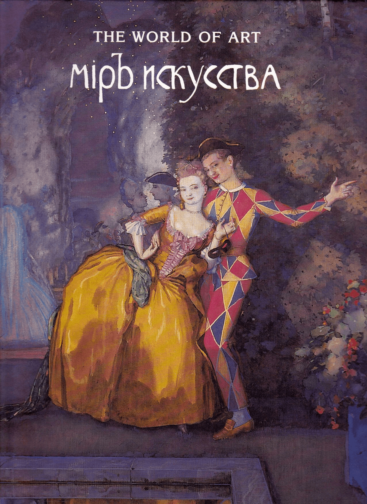
Mir Iskusstva
Mir Iskusstva(World of Art) was a St. Petersburg circle that became a magazine that became an exhibition society that eventually became the Ballets Russes. The trajectory tells you something about what the group actually valued: they started with ideas about painting and ended up synthesizing music, dance, costume, and stage design into a single event. Total aesthetic experience was always what they were after. It started as a group of friends. In the early 1890s, a loose set of young men in St. Petersburg — Sergei Diaghilev, Alexandre Benois, Léon Bakst, Konstantin Somov, Walter Nouvel, Dmitri Filosofov — were meeting regularly to talk about art, music, theater, and everything happening in Western Europe that Russia was ignoring. They were educated, cosmopolitan, aesthetically obsessive, and mostly oriented toward Paris and London rather than Moscow. Several of them were gay, which shaped the group's sensibility in ways that are worth being direct about — the aesthetic of refinement, beauty as an end in itself, the decorative arts taken seriously, the 18th century aristocratic past treated with fascination rather than guilt, all of this had a specific cultural flavor that came partly from who these people were.
Diaghilev was the organizer, the impresario, the person who made things happen. He had the energy and the social intelligence to turn a circle of aesthetically sophisticated friends into an institution. Benois was the theorist — a genuine art historian and critic who could articulate the position. Bakst was the greatest visual talent of the group, whose sense of color and flat decorative design would eventually define the look of the Ballets Russes. Somov was the strangest painter — his pictures of rococo figures in 18th century gardens have an eerie, slightly erotic quality, beautiful and melancholy simultaneously.
Funded initially by the railway magnate Savva Mamontov and the patron Princess Maria Tenisheva, the Mir Iskusstva magazine published art criticism, literary essays, and — crucially — high-quality reproductions of paintings, both Russian and Western. This last function was more important than it might seem. Russia had no equivalent of the French or German art press. There was no mechanism by which a Russian artist in St. Petersburg or Moscow could systematically see what was happening in London or Paris or Munich. The magazine provided that — introducing Whistler, Böcklin, Puvis de Chavannes, the English Pre-Raphaelites, Edvard Munch, the Scandinavians, and the decorative arts of Art Nouveau to Russian readers alongside original Russian work. The symbolist poets — Merezhkovsky, Zinaida Gippius, Valery Bryusov — published in its pages alongside the visual art. This mix of poetry and painting was deliberate: the group was interested in the Wagnerian idea of the total artwork, the synthesis of all the arts into a unified aesthetic experience. No department of aesthetic experience was separate from any other. The magazine closed in 1904, partly for financial reasons, partly because internal tensions had accumulated. But it had done its work — it had established the position and built the network.
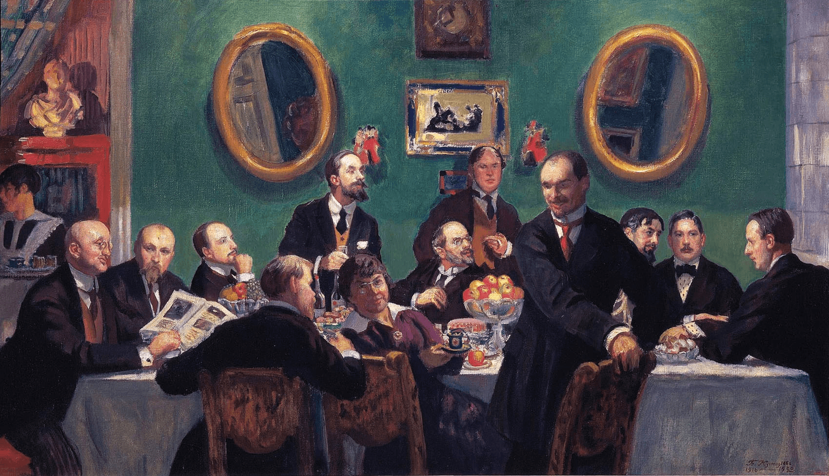
Their aesthetic position was a substantial inversion of the Wanderers, though the relationship wasn't purely oppositional from the start — the early Mir Iskusstva exhibitions included Wanderers like Repin and Levitan alongside the aestheticist circle, and the polemics sharpened over time rather than beginning as clean opposition. But the theoretical position Benois articulated in the magazine was clear: where the Wanderers said art must serve social reality, Mir Iskusstva said art serves nothing except itself. The demand that painting carry moral or political content was, in their view, a category error — applying criteria from outside art to judge something that could only be judged from within. A painting's value was its aesthetic quality, full stop. Social utility was irrelevant. Tendentsioznost — tendentiousness — was a term of condemnation in their critical vocabulary. The intellectual sources were primarily French Symbolism — Baudelaire, Verlaine, Mallarmé — and the broader European aestheticist current: Whistler, whose idea of painting as tonal arrangement rather than narrative or social document was explicitly championed in the magazine; Böcklin, the German Symbolist painter whose mysterious mythological landscapes they reproduced and admired; the English Pre-Raphaelites, Burne-Jones especially; and above all Wagner, whose concept of the Gesamtkunstwerk — the total artwork synthesizing music, theater, and visual design — was the animating ambition behind everything Diaghilev would eventually build. Oscar Wilde's formulation from the Preface to Dorian Gray — "all art is quite useless" — captured the position neatly, whether or not it was a direct source: the uselessness of art was its dignity.
This produced a specific set of visual interests. They were drawn to the early 18th century Russian aristocratic world — the Petrine era, the neoclassical palaces of St. Petersburg, the formal gardens of Peterhof — as an aesthetic realm of refinement and ceremony that the 19th century's social urgency had swept aside. Benois made extended painting series at Versailles and Peterhof, rendering both with the same elegiac attention: beautiful things in decline, the past visible as loss. Somov placed porcelain-doll figures in powdered wigs against parkland backgrounds, frozen in a rococo moment that had already ended. This retrospective nostalgia was not simply conservatism — it was an aesthetic choice, a preference for the formally sophisticated over the socially earnest. But it also encoded a class orientation that the group's critics identified immediately. Vladimir Stasov, the Wanderers' chief critical advocate, attacked Mir Iskusstva repeatedly as decadent — Western affectation that had abandoned the Russian people for the refinement of an educated elite. The accusation was not entirely wrong.
French Symbolism , 1880s
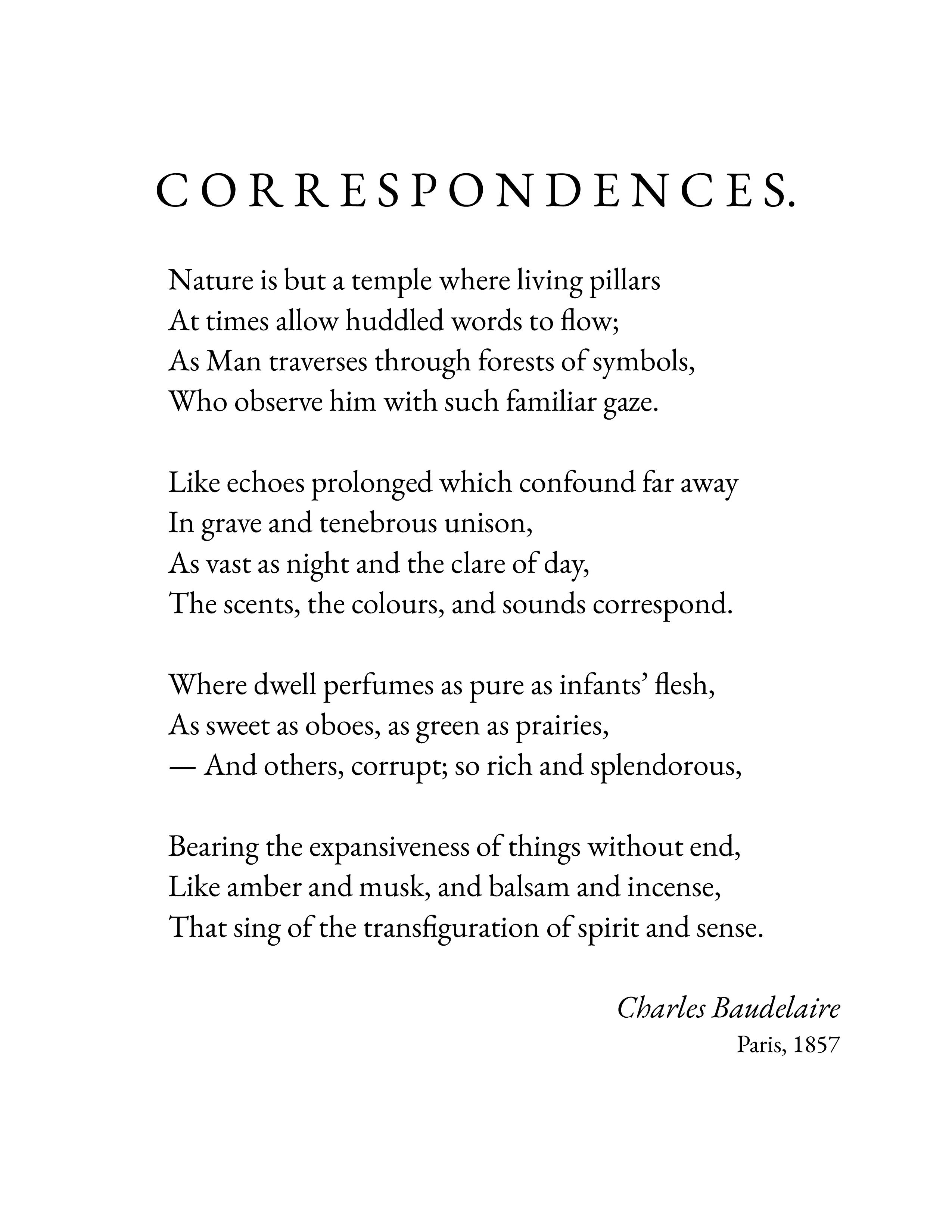
A literary and artistic movement that emerged in France in the 1880s, built on the conviction that reality has a deeper dimension that can't be directly described — only evoked, suggested, gestured toward through symbols and correspondences. The visible world is a surface. What matters is underneath it. This sounds mystical because it partly was. But it also had a precise aesthetic logic that produced some of the most formally rigorous work of the 19th century. The foundation is Baudelaire — specifically one sonnet called Correspondances, published in Les Fleurs du Mal in 1857. The poem argues that the sensory world — sounds, colors, smells — corresponds to and can evoke spiritual or emotional states that lie beyond direct expression. Nature is a forest of symbols that watches humans pass. The senses are not separate from each other — a color can be heard, a sound can be seen, a perfume can contain an entire emotional world. These crossings between the senses became one of the movement's central preoccupations.The term "Symbolism" was formally coined by the poet Jean Moréas in a manifesto published in Le Figaro in 1886, but the position had been developing for decades through Baudelaire, Verlaine, and Mallarmé before anyone gave it a name.
The movement was primarily literary, but it had direct visual art parallels. Gustave Moreau painted mythological and biblical subjects — Salome, Orpheus, the Sphinx, Hercules — with an intensity of jeweled color and surface decoration that had nothing to do with academic illustration. The subjects were pretexts for psychological states: desire, death, the encounter between the mortal and the transcendent. His canvases are densely encrusted with symbolic objects and archaic detail, beautiful in a way that is deliberately excessive, as if the surface is about to collapse under the weight of what it's carrying. He was also an influential teacher at the École des Beaux-Arts — his students included Matisse and Rouault, which is a remarkable pedagogical legacy for someone so little known outside specialist circles. Odilon Redon made charcoal drawings of things that couldn't exist: floating eyeballs, spiders with human faces, heads without bodies drifting in darkness. Later he moved to vivid pastels and oils — fragmented faces surrounded by flowers, atmospheric color that had no descriptive function. He described his method as "the logic of the visible put at the service of the invisible," which is a precise summary of the Symbolist visual program. Puvis de Chavannes painted large mural-scale works of classical figures in indeterminate landscapes, in pale, almost bleached color, with a quality of timeless stillness that was the opposite of academic dynamism. His figures do nothing urgent. They exist in a space outside narrative, outside history. He was enormously influential on the Post-Impressionists — Gauguin, Seurat, the Nabis — for exactly this quality of constructed artificiality. The movement dissolved as a named tendency around 1900, but what it released went everywhere. Art Nouveau absorbed the Symbolist decorative tendency — the organic line, the emphasis on surface, the elevation of craft and decoration to the level of high art.

Art Nouveau, 1890s
An international design movement that ran roughly from 1890 to 1910, centered on a single formal conviction: ornament should grow from structure the way a plant grows from soil. Not decoration applied to a surface but decoration that is the surface, inseparable from the thing it covers. It had different names in different countries — Jugendstil in Germany, Sezessionsstil in Austria, Stile Liberty in Italy, Style Moderne in Russia, Modernisme in Catalonia — but the visual language was recognizable across all of them: the sinuous organic curve, the whiplash line, the flat decorative surface, the absorption of natural forms — plants, flowers, insects, waves, female hair — into structural elements. There were mainly two sources that inspired this movement. The first was the English Arts and Crafts movement, specifically William Morris. Morris's argument, developed from the 1860s onward, was that industrial mass production had destroyed the relationship between the maker and the made thing, and that the result was ugliness — ugly objects produced by workers who had no investment in what they were making, bought by consumers who had forgotten what beautiful things felt like. His solution was the handmade object, produced by an artisan who controlled the entire process, derived from natural forms, built to last. He designed wallpapers, textiles, furniture, stained glass. His patterns — interlocking leaves and flowers and birds — were derived from close observation of actual plants and medieval decorative traditions. He was also a committed socialist, which created the central irony of his career: his handmade objects were beautiful and expensive, available only to the wealthy people whose taste had driven them to Morris precisely because they were rejecting mass-produced ugliness. Beautiful things for the rich, made by skilled workers who believed in equality.
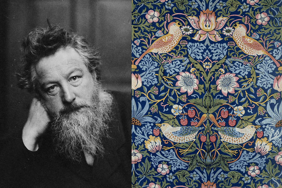
The second source was Japanese art. After Japan opened to Western trade in the 1850s, Japanese woodblock prints — ukiyo-e — flooded European markets and were revelatory to European artists trained in the academic tradition of three-dimensional illusionism. Japanese art used flat color, strong outlines, asymmetric composition, dramatic cropping, and the decorative integration of natural forms in ways that European academic painting had systematically excluded. Hokusai's wave — the Great Wave off Kanagawa — is the most reproduced image of this encounter: the wave as a formal element, its foam as claws, the whole composition organized as flat pattern rather than three-dimensional space. The influence on Van Gogh, on Toulouse-Lautrec, on the Nabis, and on Art Nouveau directly was immediate and acknowledged. These two sources combined into a movement that wanted to redesign the entire visual environment — not just paintings but buildings, furniture, wallpaper, textiles, cutlery, door handles, lamp fittings — using organic formal principles derived from nature and Japanese art, produced with the craft seriousness Morris had championed.
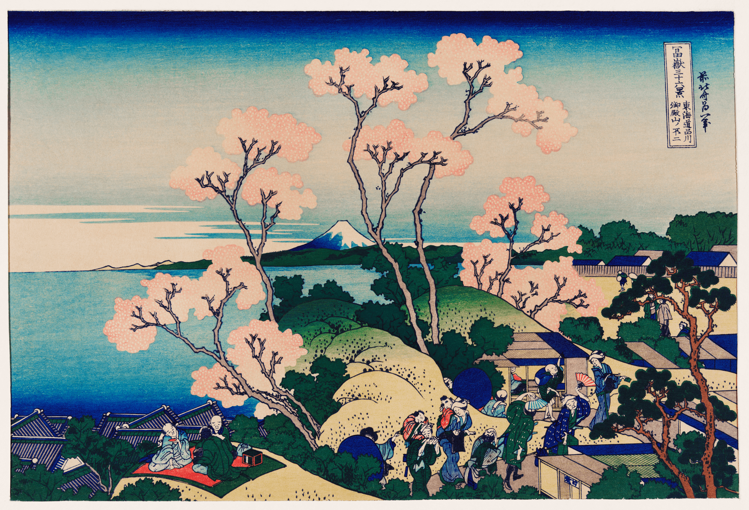
The central formal contribution of Art Nouveau was what became known as the whiplash line — a sudden, dramatic S-curve derived from plant stems and waves and the movement of flames and hair. This line was not geometric. It didn't resolve into a circle or a right angle. It was alive in the sense that growing things are alive: bending toward light, thickening where it needed to bear weight, thinning where it could afford to. The argument behind the line was that the geometric, mechanical forms of industrial production were hostile to human perception — that humans were organic creatures who experienced organic forms as natural and geometric forms as imposed. The whiplash line was an attempt to make designed objects feel continuous with the natural world rather than opposed to it.
Victor Horta's Hôtel Tassel in Brussels, completed in 1893 and usually cited as the first fully realized Art Nouveau building, makes this argument structurally. The load-bearing ironwork columns are exposed rather than hidden behind plaster or stone cladding, and their structural function is expressed through organic curving forms — the column becomes a plant-stem, the branching of structural members becomes a canopy of leaves. The iron IS the decoration. There is no separation between the engineering and the aesthetic. This was the architectural equivalent of what Morris wanted from furniture — the thing that makes it work and the thing that makes it beautiful are the same thing.
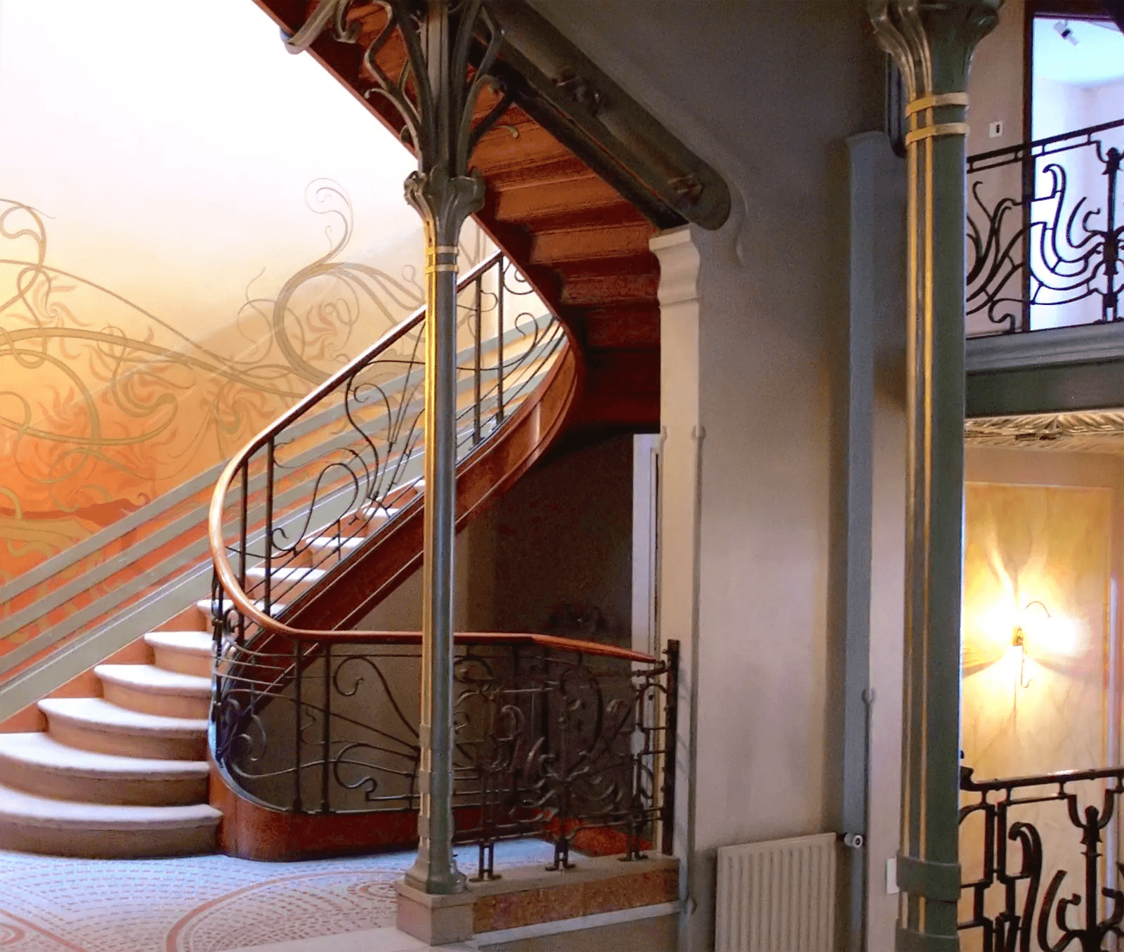
Art Nouveau practitioners pursued the Gesamtkunstwerk — the total work of art — more consistently than almost any other movement. Horta designed not just the Hôtel Tassel but its furniture, stair railings, door handles, light fittings, wallpaper — everything unified by the same organic visual language, so that moving through the building was moving through a single coherent aesthetic system. Gaudí designed the furniture for his buildings. The Vienna Secession building contained Klimt's Beethoven Frieze in its interior exhibition space. The Wiener Werkstätte — the Vienna Workshops founded by Josef Hoffmann and Koloman Moser in 1903 — produced architecture, furniture, textiles, jewelry, cutlery, and stationery as a unified design practice. This ambition — that there should be no hierarchy between architecture and a teaspoon, that every object in the designed environment deserved the same quality of attention — was inherited directly from Morris and became the central commitment of the Bauhaus twenty years later.
The World War ended it. The ornamental excess of Art Nouveau — all those curves and flowers and whiplash lines — looked wrong after 1914. The generation that had spent years in the trenches had no appetite for beautiful surfaces. Stripped-down functionalism, industrial honesty, the elimination of ornament — these became the dominant aesthetic values of the 1920s. Adolf Loos, the Viennese architect, had been arguing against ornament since 1908 in an essay called Ornament and Crime, which claimed that the impulse to decorate surfaces was a sign of cultural primitivism. This was extreme and partly wrong but captured a mood. The Bauhaus, founded in 1919, took a more nuanced position — design should be functional but not therefore ugly — but it shared the reaction against Art Nouveau's decorative excess.The irony is that several of the most important Art Nouveau figures seeded what came next. Henry van de Velde, who came from Art Nouveau in Belgium, founded the Weimar Kunstgewerbeschule in 1908 — the school that Walter Gropius renamed the Bauhaus in 1919. The Bauhaus was partly a repudiation of Art Nouveau but it inherited Art Nouveau's fundamental premise: that design unifies art and craft, that there is no legitimate hierarchy between fine art and applied design, that the aesthetic quality of everyday objects matters.
Alexandre Benois (1870–1960)
He lived ninety years, which meant he was born into the world of Alexander II and died in the world of Charles de Gaulle, and spent most of his adult life writing about and designing for a version of European culture that had ceased to exist by 1914. This long survival gave his career a particular character: he was always, to some degree, a custodian of something that was already over. His family background is unusual for someone associated with Russian national art. The Benois family was French in origin — his grandfather had come from France to Russia as a confectioner and stayed, his father Nikolai Benois became one of St. Petersburg's most prominent architects, his uncle Léon Benois was also an architect. The family was embedded in the artistic and technical establishment of the imperial capital, French in name and cultural orientation but thoroughly St. Petersburg in sensibility — the specific hybrid that defined educated life in that city.
He didn't go to the Academy. He studied law at St. Petersburg University, which was not unusual for someone from his background — the Academy was for professional painters, not for cultivated young men of the educated class who happened to draw well. He was largely self-taught as a visual artist, formed by reading, travel, obsessive looking in museums, and the particular intellectual atmosphere of the circle he moved in. He spoke and read French, German, and Russian with equal fluency. He had been to Versailles before he had a career. This formation — encyclopedic, historically oriented, more critic and theorist than studio painter — shaped everything he did. He thought about art the way an art historian thinks about it: in terms of periods, influences, traditions, the relationship between one thing and everything that preceded it. When he picked up a brush he was always, simultaneously, writing an essay in paint.
His characteristic work is atmospheric and retrospective. The paintings feel like memories of places rather than observations of them — they have the quality of something slightly further away than the present moment. His Versailles series is the most sustained body of work. He made multiple extended trips to Versailles specifically to paint it and produced dozens of canvases over several years — the formal gardens, the fountains, the grand allées, the ornamental water. The paintings are not topographical records. They're meditations on what Versailles means: an aesthetic system, the idea that power can express itself as geometric order imposed on nature. Louis XIV understood that Versailles was a political statement made through landscape design. Benois found this endlessly interesting — the point where art, architecture, and state authority converged.
Versailles
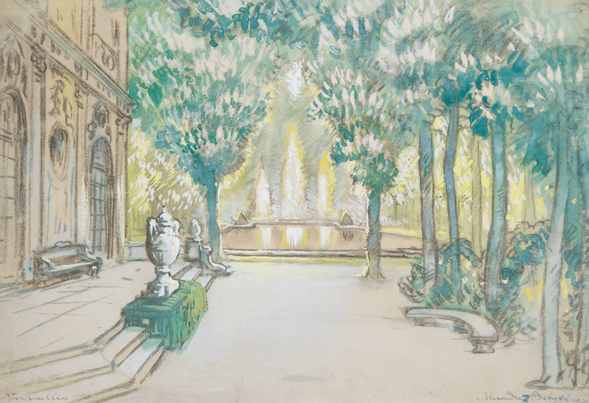
He first went to Versailles in 1896, on his first extended trip to France. He was twenty-six. The encounter was immediate and total — he described it later as the place that most completely embodied everything he believed about art, power, and the relationship between human will and designed space. He returned multiple times over the following decade, staying long enough each visit to work through different seasons, different light conditions, different parts of the grounds. The paintings he produced across these visits constitute his most coherent and sustained statement as a visual artist.
Versailles is not primarily a building. It is a landscape system — André Le Nôtre's design for the gardens is the work, and the palace is its backdrop. Le Nôtre was Louis XIV's landscape architect, and what he created was the most ambitious exercise in geometric order imposed on nature that Western civilization had produced. The gardens extend from the palace in a series of axes and cross-axes, parterres and allées, basins and fountains, all organized around the central axis that runs from the King's bedchamber through the Hall of Mirrors through the garden to the horizon. The geometry is visible from above as a mathematical proof. From inside it, you feel the discipline of the system without necessarily understanding its totality. Benois understood Versailles as a political artwork. Louis XIV built it to communicate a specific argument about power: that the King's authority was so complete it could impose rational order on nature itself, that civilization under his rule was not just orderly but geometrically perfect. Every visitor to Versailles in the 17th century was receiving a political message delivered through aesthetic experience. The garden was propaganda made beautiful enough that the propaganda disappeared into the beauty. This is exactly what Benois found interesting — the convergence of aesthetic perfection and political authority, the point where art and power were inseparable. He was not naively admiring the ancient régime. He was fascinated by how it had expressed itself, by the specific visual language it had developed, by what it meant that a king communicated absolute authority through the geometry of a hedge.
Peterhof
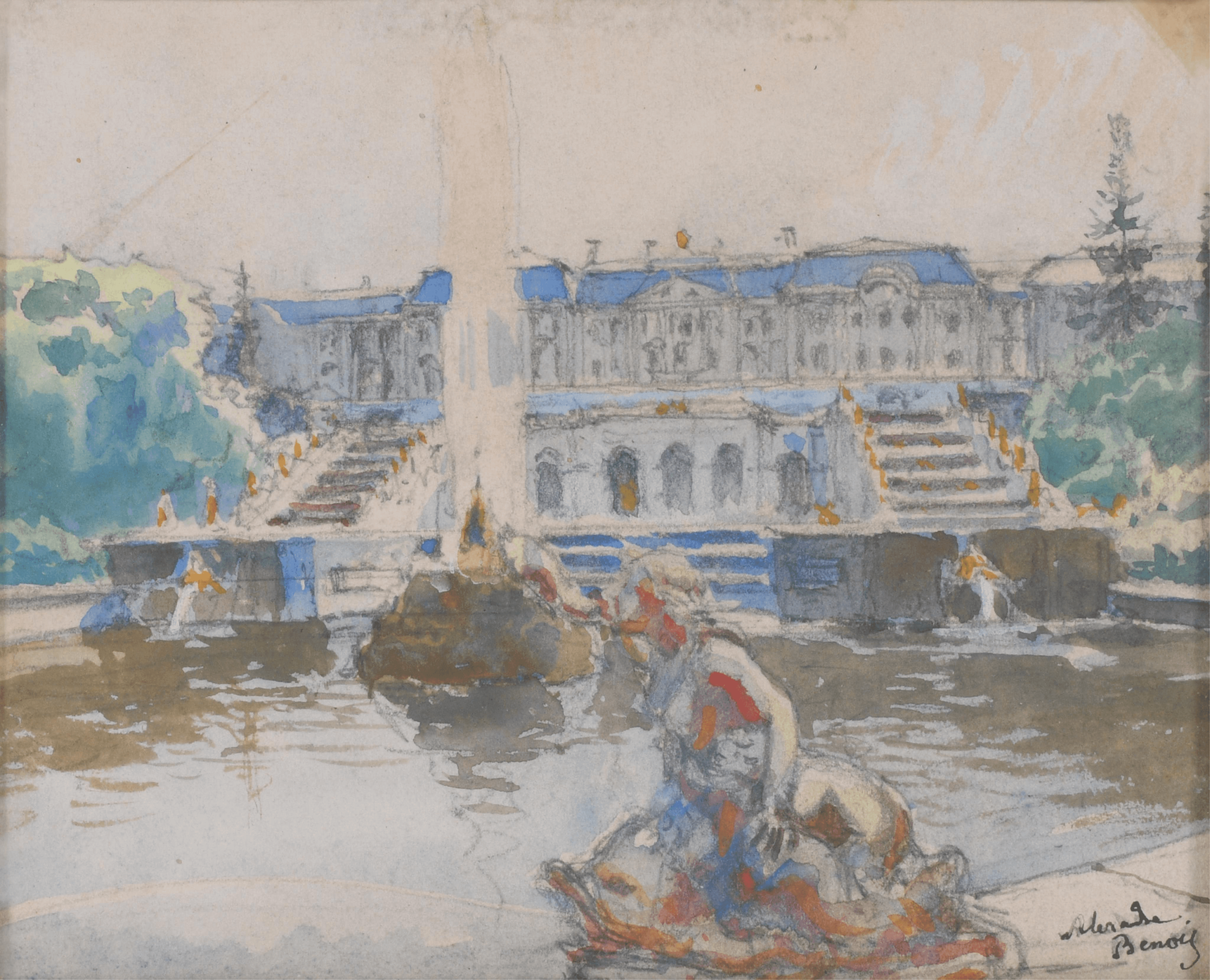
His Peterhof paintings have the same elegiac quality but with an additional layer: this is Russian, this is what Peter the Great built in deliberate imitation of Versailles, this is the moment when Russia decided it was European. Standing at Peterhof, Benois was looking at his own culture's defining act of self-invention. Peterhof sits on the Gulf of Finland thirty kilometers west of St. Petersburg, built on a terrace of land where a natural escarpment drops from the upper garden to the shore. Peter the Great chose the site specifically for this topography — the slope gave him the pressure differential he needed to run fountains without pumping machinery, fed by a system of reservoirs and channels he commissioned from across the surrounding countryside. The engineering was the point as much as the aesthetics. Versailles had fountains that required enormous hydraulic effort to maintain. Peter built a system that ran on gravity alone, which was itself a statement: we have solved the technical problem better than the French. He had visited Versailles in 1717 on his second European tour. He walked the gardens with the specific attention of someone taking notes. He brought back French architects, landscape designers, sculptors. He hired Jean-Baptiste Le Blond, one of Le Nôtre's former associates, to design the layout. The result was deliberately Versailles-adjacent — the central axis running from the palace through the Grand Cascade to the sea, the formal parterres, the geometric hedgerows — but with the modifications that Russian topography and Russian ambition required.
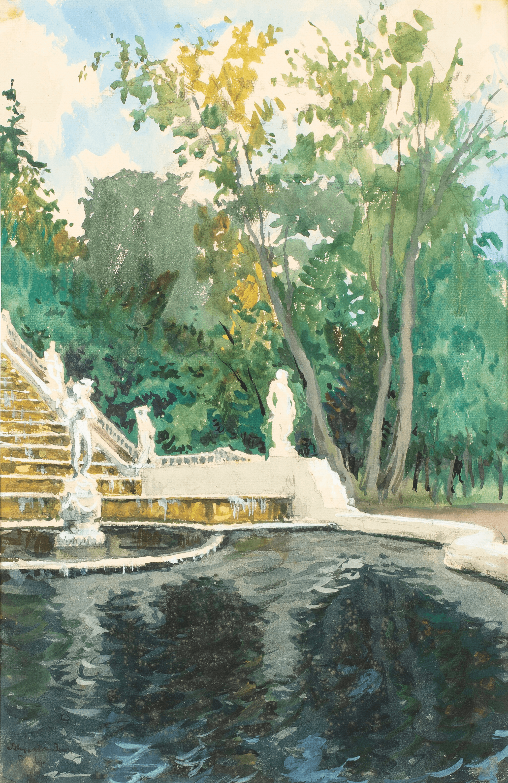
When Benois stood at Peterhof with his sketchbook, he was standing at the site where Russian imperial identity had been most explicitly constructed through aesthetic means. Peter the Great's project — the entire project, not just Peterhof — was to transform Russia into a European power, which required transforming what Russia looked like. The old Muscovite architecture, the Byzantine domes, the wooden churches, the Asiatic visual language of the pre-Petrine world — Peter suppressed all of it in favor of European forms. He built St. Petersburg from nothing on a Finnish marsh specifically because Moscow carried too much of the old Russia in its bones. The new capital would be European from birth, designed by European architects on European principles. Benois understood this not as cultural insecurity but as a specific act of will — a civilization deciding, at a precise historical moment, to reinvent itself. He found this fascinating in the same way he found Versailles fascinating: both places were political arguments made through aesthetic systems. The difference was that Versailles argued for the perfection of an order that had existed for centuries, while Peterhof argued for the existence of something that didn't exist yet — a Europeanized Russia that was still being built as the foundations were being laid.
His Peterhof canvases have a different emotional register from the Versailles work, and the difference is precise. At Versailles the absence is complete — the life the garden was designed for ended two hundred years before Benois arrived, and nothing has replaced it. At Peterhof the situation was more complicated: the imperial court still existed, still used the palace, still activated the fountains for summer seasons. The life the garden was designed for was, when Benois was painting, still partially ongoing. This produced a specific kind of double exposure in the paintings. The Versailles work is pure elegy — past tense throughout. The Peterhof work catches something still technically present but already visible as historical, already being observed from a slight distance that shouldn't yet exist. Benois was applying to a living institution the same elegiac attention he had developed for a dead one, and the gap between those two positions is visible in the paintings as a faint wrongness, a quality of looking at something that is still there as if it were already gone.
Petrushka
His most significant single work is not a painting but a ballet — Petrushka, 1911, with music by Stravinsky and choreography by Fokine. Benois designed the sets and costumes, and there is reasonable evidence that the subject was partly or largely his idea, which became a source of conflict with Stravinsky later. The ballet is set in a St. Petersburg fairground during Maslenitsa — the carnival week before Lent. At the center is a puppet theater containing three characters: Petrushka the clown, the Moor, and the Ballerina. The puppeteer brings them to life; Petrushka, who is conscious and suffering, loves the Ballerina; the Moor kills him; the crowd at the fairground doesn't understand what they're watching. At the end, Petrushka's ghost appears above the puppet theater. What Benois designed was St. Petersburg street life in the 1830s — the fairground booths, the crowds in period costume, the specific visual atmosphere of a Russian winter festival. The design is precise in its historical observation and completely theatrical in its organization: everything is slightly exaggerated, slightly brighter than reality, the way memory makes places vivid rather than accurate.
The specific occasion is Maslenitsa — the Russian carnival week before the beginning of Orthodox Lent, equivalent to Mardi Gras in its calendar position and in its logic of licensed excess before the long fast. In St. Petersburg in the 1830s, the Maslenitsa fair was held in the Admiralty Square — a vast open space near the Neva, temporarily transformed each year into a fairground. The balaganы — the temporary wooden theater booths — were the center of the entertainment. These were knocked-together structures, elaborately painted on the outside with crude colorful imagery advertising what was inside: acrobats, strong men, performing animals, comedy sketches, and the Petrushka puppet theater. A Petrushknik — a street performer who was the traditional operator of the Petrushka puppet show — would carry the booth on his back through the crowds, set it up, and perform. The puppet Petrushka himself was a well-established folk figure before Stravinsky and Benois got to him: a character with a hooked nose and red costume and a high squeaky voice produced by a special vibrating device the performer held in his mouth, a trickster and rebel who beat the police and the devil and the doctor with his stick and always, eventually, got his own comeuppance.
Benois had never seen this world. By the time he was born in 1870 the Maslenitsa fairs in their traditional form had already been changing under the pressure of modernization and the city's expansion. What he designed was reconstructed from research — early 19th century Russian lithographs, watercolors by artists who had documented St. Petersburg street life in the 1820s and 1830s, written accounts in Gogol and others, historical records of costume and entertainment. He was building a world from evidence, not from memory. The challenge of designing the Petrushka set was capturing a particular visual atmosphere that had two incompatible qualities simultaneously: precise historical specificity and heightened theatrical vividness. The historical specificity was the foundation — the 1830s Maslenitsa fair had a specific visual character that was not interchangeable with any other time or place. The costume silhouettes were particular to that decade: the women's wide sleeves and narrow waists of the early Romantic period, the men's tall hats and frogged coats, the specific way class was visible in what people wore and how they moved through a crowd. The booths had a specific crude decorative vernacular — the painted imagery outside the balaganы was neither academic painting nor pure abstraction but the specific visual language of popular commercial art, designed to be read at a glance from across a crowded square. The food sellers, the coachmen, the street musicians, the nurses with their charges — each had a specific visual type attached to a specific social position that Benois had researched until he could reproduce it with confidence. But strict documentary accuracy would have produced a dull stage. The audience was not there to view a historical exhibition. They were there to experience a world, and experiencing a world requires something more than accurate costumes and correctly proportioned booths. Benois calibrated everything slightly upward — colors a fraction more saturated than strict historical realism would require, the crowd slightly denser, the booths slightly more vivid against the winter sky, the overall composition slightly more organized than an actual fairground would be. Not falsified but heightened. The difference between a photograph of a place and a memory of it — both accurate in different ways, the memory truer to the emotional fact.
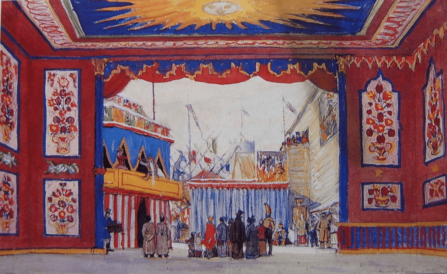
The design operates through a specific color opposition. The ground of the scene is winter — snow, gray sky, the cold light of a St. Petersburg February afternoon. Against this ground the fairground booths are saturated primary colors, the red and blue and yellow of popular decoration, crude and vivid and designed for exactly the visual pop they achieve against a white and gray background. The crowd between the two layers — the cold ground and the hot booths — wears the more muted but still carefully differentiated colors of early 19th century dress. This opposition was not arbitrary. It reproduced the actual visual logic of a winter fair, where the artificial color and warmth and light of the booths was what drew people toward them across cold open ground. The design made legible the experience of cold and color and noise and warmth that was the psychological content of the Maslenitsa fair — the specific pleasure of festivity in winter, the relief of color against gray, the warmth of the crowd. The inside of the puppet theater — Petrushka's cell, the Moor's room, the showman's inner sanctum — operated on a completely different color logic. Benois designed these inner spaces as claustrophobic and strange: the puppet theater's interior striped in crude red and black, the Moor's room an orientalist fantasy of green and gold. The contrast between inside and outside was the contrast between the folk's experience of the fair from outside and the puppets' experience from within — the crowd sees entertainment, the puppets live a tragedy.
The most precise element of the design was the puppet theater itself — the showman's booth, the small stage inside the larger stage on which Petrushka and the other puppets performed. Benois understood that the design needed to hold two scales simultaneously. The outer stage — the fairground, the crowd, the city — was the world as the people in it experienced it: large, cold, busy, anonymous. The inner stage — the puppet theater — was the world as Petrushka experienced it: tiny, contained, watched from outside, performing a drama that the audience thought was entertainment and that Petrushka knew was his actual life. The design made this visible through scale and color. The puppet theater was at once the center of the composition — the thing everyone in the crowd was looking at, the thing the audience in the theater was organized toward — and something reduced and enclosed, a box within a box. The crowd filled the vast winter square. Petrushka was in a painted cell the size of a wardrobe. This is the structural argument that Benois brought to the design and that the design makes without words: the space available to consciousness varies according to where you are in the social hierarchy, and the person with the least space is the person who feels the most. The fairground is enormous. Petrushka's cell is tiny. The relationship between those two spaces is what the ballet is about. More on World of Art magazine / movement in the next post.
🖼️